
Modern users access websites across smartphones, tablets, laptops, and desktop computers, often for long periods. As digital experiences continue to evolve, website designers are paying greater attention to visual comfort, accessibility, personalization, and user experience.
One design trend that has become increasingly common is dark mode website design.
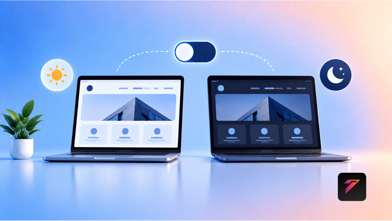
Dark mode uses a dark background with lighter text and interface elements instead of the traditional light-background design. Many operating systems, applications, and websites now provide dark themes that users can enable according to their preferences.
For businesses, dark mode is more than simply changing a website’s background color. When planned correctly, it can influence visual hierarchy, branding, readability, interface consistency, and the overall browsing experience.
However, dark mode should not be treated as an automatic replacement for light mode. A well-designed website should consider contrast, accessibility, device settings, content readability, images, forms, buttons, and user preferences.
In this guide, we will explore what dark mode website design means, why it matters, its benefits, accessibility considerations, implementation strategies, common mistakes, and best practices for modern business websites.
What Is Dark Mode Website Design?
Dark mode website design is a visual interface approach that uses darker backgrounds and lighter foreground elements.
A typical dark interface may include:
- Dark background
- Light-colored text
- Contrasting buttons
- Muted secondary text
- Bright accent colors
- Dark form fields
- Adjusted images and illustrations
- Dark navigation elements
For example:
Light Mode
Light background + dark text + colored accents
Dark Mode
Dark background + light text + colored accents
Modern dark interfaces often use multiple shades rather than a single black background.
This allows designers to create visual hierarchy while maintaining appropriate contrast.
Build a Website That Grows Your Business
A professionally developed website is the foundation of your online success. If you’re planning to create a responsive, fast, and SEO-friendly business website, explore our Website Development Services to see how Hashseven can help transform your ideas into a powerful digital presence.
Why Dark Mode Is Becoming Popular
Dark interfaces have become common across operating systems, mobile applications, development tools, entertainment platforms, and productivity software.
Users may choose dark mode because they:
- Prefer darker interfaces
- Browse websites at night
- Want a different visual appearance
- Use operating-system dark themes
- Find certain interfaces more comfortable
- Prefer personalized digital experiences
This growing user expectation has encouraged businesses to consider dark mode as part of their website design strategy.
1. Provides a Personalized User Experience
One of the main advantages of dark mode website design is personalization.
Different users have different visual preferences.
Some users prefer light interfaces, while others prefer dark interfaces.
Providing a theme option gives visitors greater control over how they experience a website.
A simple theme switcher can provide:
Light Mode ↔ Dark Mode
Businesses can also respect a user’s operating-system preference by detecting the browser’s preferred color scheme.
2. Creates a Modern Visual Appearance
Dark interfaces can create a modern and sophisticated appearance when designed carefully.
Dark backgrounds can work particularly well for:
- Technology companies
- Creative agencies
- SaaS products
- Portfolio websites
- Entertainment businesses
- Gaming websites
- Luxury brands
- Digital products
However, visual style should support the brand rather than replace a clear design strategy.
3. Improves Visual Hierarchy
Dark backgrounds can make certain interface elements stand out.
Designers can use:
- Bright accent colors
- White or light typography
- Cards with subtle contrast
- Highlighted buttons
- Images
- Icons
This can help direct attention toward important interface elements.
For example:
Dark Background
↓
Bright CTA Button
↓
Primary User Action
The contrast between background and foreground can help create a clear visual hierarchy when accessibility requirements are maintained.
4. Can Make Visual Content Stand Out
Dark backgrounds can provide an effective backdrop for certain types of visual content.
For example:
- Product photography
- Digital artwork
- Videos
- Illustrations
- Photography portfolios
- UI mockups
The darker surrounding interface can help visual content become a prominent part of the page.
This is particularly useful for websites where visual presentation is central to the user experience.
5. Supports Brand Differentiation
Businesses can use dark themes as part of their visual identity.
A carefully designed dark interface can communicate a particular brand personality.
For example, a technology company might use:
- Deep charcoal
- Blue accents
- White typography
- Subtle gradients
A creative studio might use:
- Dark neutral backgrounds
- Bold typography
- Bright accent colors
- Large imagery
The important point is consistency.
6. Works Well With Strong Accent Colors
Dark backgrounds can make accent colors visually prominent.
Colors such as:
- Blue
- Green
- Purple
- Orange
- Cyan
can create strong visual contrast against darker backgrounds.
However, designers should avoid using extremely bright colors everywhere.
Accent colors should be used strategically for:
- Buttons
- Links
- Icons
- Highlights
- Important information
7. Can Reduce Visual Brightness in Dark Environments
A dark interface can reduce the amount of bright background area displayed on the screen.
This may feel more comfortable for some users in darker environments.
However, businesses should avoid claiming that dark mode universally reduces eye strain or improves eye health. User comfort can vary depending on display technology, lighting conditions, text size, contrast, and individual preferences.
8. Can Complement OLED Displays
On OLED displays, black pixels can be turned off individually.
Because of this, dark interfaces may use less energy than bright interfaces in some circumstances.
The actual battery impact depends on:
- Display technology
- Brightness
- Screen size
- Content
- Device settings
- Amount of true black used
Therefore, dark mode should not be presented as a guaranteed battery-saving solution for every device.
9. Supports Modern Mobile Experiences
Many users browse websites through smartphones.
Modern mobile operating systems commonly provide light and dark theme preferences.
A responsive website can adapt its appearance according to the user’s selected theme.
This creates a more consistent experience between the user’s device and website.
10. Can Improve Perceived Interface Comfort
A well-designed dark interface can feel visually comfortable for some users, particularly when browsing in low-light environments.
However, comfort depends heavily on design quality.
Poor contrast, tiny typography, excessive brightness, or overly saturated colors can make a dark interface difficult to use.
This is why accessibility should remain central to dark mode design.
Dark Mode and Accessibility
Dark mode should be designed with accessibility in mind.
The W3C Web Accessibility Initiative provides resources for building accessible web experiences.
One important consideration is color contrast.
Text must remain sufficiently distinguishable from its background.
Designers should not simply convert:
White Background → Black Background
and assume the design is automatically accessible.
Instead, colors should be evaluated individually.
Use Sufficient Color Contrast
Dark interfaces often use multiple shades of gray rather than pure black.
For example:
- Background: Very dark gray
- Surface: Slightly lighter gray
- Primary text: Light gray or white
- Secondary text: Muted light gray
- Accent: Brand color
This creates layers within the interface.
Avoid Pure White Everywhere
Pure white text against a very dark background can create strong contrast.
While strong contrast is important, using slightly softened light colors for large amounts of text can sometimes create a more balanced visual hierarchy.
The correct choice depends on the design and accessibility requirements.
Don’t Use Color Alone
Important information should not depend only on color.
For example, instead of showing:
Green = Success
and
Red = Error
use:
- Icons
- Text labels
- Clear messages
- Appropriate visual indicators
This helps users who have difficulty distinguishing certain colors.
Dark Mode and Typography
Typography becomes especially important in dark interfaces.
Businesses should consider:
- Font size
- Font weight
- Line height
- Letter spacing
- Text contrast
- Paragraph width
Long paragraphs can become difficult to read when typography is too small or low contrast.
A clear typographic hierarchy can include:
H1
Large and prominent.
H2
Clearly separated section heading.
Body Text
Comfortable size with sufficient contrast.
Supporting Text
Slightly muted but still readable.
Dark Mode and Images
Images may need to be considered separately when designing a dark theme.
Some images naturally work well against dark backgrounds.
Others may appear visually disconnected.
Designers can consider:
- Image backgrounds
- Transparent PNG/SVG assets
- Image borders
- Shadows
- Cropping
- Surrounding spacing
Images should remain clear without unnecessary filters.
Dark Mode and Videos
Video content can work particularly well with dark interfaces because many video players already use dark controls.
However, designers should make sure:
- Video controls remain visible
- Captions are readable
- Play buttons have sufficient contrast
- Surrounding content remains accessible
Dark Mode and Forms
Forms are often overlooked during theme development.
A dark website should carefully style:
- Input fields
- Labels
- Placeholder text
- Dropdowns
- Checkboxes
- Radio buttons
- Error messages
- Success messages
- Focus indicators
For example, placeholder text should not be so faint that users cannot read it.
Dark Mode and Buttons
Buttons need strong visual distinction.
A dark interface might use:
Primary Button: Bright brand color
Secondary Button: Dark surface with visible border
Text Button: Light text with clear hover state
Buttons should clearly communicate their interactive state.
Dark Mode and Navigation
Navigation menus should remain easy to understand.
Designers should consider:
- Logo visibility
- Navigation text contrast
- Active links
- Hover states
- Dropdown menus
- Mobile menus
- Menu icons
A dark navigation bar should not make important links disappear visually.
Automatic Dark Mode vs Manual Theme Switching
There are two common approaches.
Automatic Dark Mode
The website detects the user’s system preference.
For example:
Operating System → Dark Mode → Website Dark Theme
This can provide a seamless experience.
Manual Theme Switching
The website provides a theme control.
For example:
☀ Light | 🌙 Dark
This gives users direct control.
Supporting Both Approaches
For many websites, supporting both can provide greater flexibility.
The website can:
- Detect the user’s system preference.
- Apply an appropriate default theme.
- Provide a manual switch.
- Remember the user’s preference.
The exact implementation should depend on the website’s technical architecture and user requirements.
CSS Media Query for Dark Mode
Modern websites can use the prefers-color-scheme media feature to detect the user’s preferred color scheme.
For example:
@media (prefers-color-scheme: dark) {
    body {
        background: #111;
        color: #f5f5f5;
    }
}
A production website should define a complete theme system rather than changing only the body background.
This includes:
- Text colors
- Background colors
- Borders
- Buttons
- Forms
- Cards
- Navigation
- Icons
- Shadows
Use CSS Variables for Theme Management
CSS variables can make theme management easier.
For example:
:root {
    --background: #ffffff;
    --text: #222222;
    --surface: #f5f5f5;
}

[data-theme="dark"] {
    --background: #121212;
    --text: #f5f5f5;
    --surface: #1e1e1e;
}
Then the website can use:
body {
    background: var(--background);
    color: var(--text);
}
This approach can make theme maintenance more organized.
Dark Mode and Website Performance
Dark mode itself does not automatically make a website faster.
Website performance depends on factors such as:
- Hosting
- Images
- JavaScript
- CSS
- Fonts
- Third-party scripts
- Caching
- Network conditions
However, a well-structured theme system can make it easier to maintain consistent styles without unnecessarily duplicating large amounts of CSS.
Businesses should continue optimizing the entire website rather than assuming dark mode improves performance.
Dark Mode and SEO
Dark mode is primarily a user-experience and design feature rather than a direct SEO ranking factor.
Search engines still need to access and understand:
- Text
- Navigation
- Structured content
- Metadata
- Links
- Images
- Page structure
A dark theme should never hide important content from users or search engines.
Businesses should continue focusing on:
- Helpful content
- Technical SEO
- Mobile usability
- Page performance
- Accessibility
- Internal linking
- Structured data
- Search intent
Google‘s SEO Starter Guide provides guidance on creating search-friendly websites.
Dark Mode and User Experience
Good dark mode design should feel intentional rather than simply inverted.
Consider these elements:
Color
Use a carefully selected dark palette.
Typography
Maintain readable font sizes and weights.
Contrast
Ensure important elements remain distinguishable.
Spacing
Maintain the same clear layout structure.
Interaction
Provide visible hover, focus, active, and disabled states.
Consistency
Apply the theme across the entire website.
Common Dark Mode Design Mistakes
1. Using Pure Black Everywhere
A completely black interface can sometimes create an overly harsh visual appearance.
Using several dark shades can create better depth.
2. Low-Contrast Text
Gray text on a dark gray background can become difficult to read.
Important text should maintain sufficient contrast.
3. Forgetting Form Elements
Changing the background without updating input fields creates inconsistent experiences.
4. Ignoring Images
Some images may look awkward against dark backgrounds.
5. Poor Button Contrast
Buttons need to stand out clearly from their surrounding surfaces.
6. Using Too Many Bright Colors
A dark interface can become visually overwhelming when every element uses a highly saturated accent color.
7. Ignoring Focus States
Keyboard users need clear focus indicators.
8. Hiding Important Information
Theme changes should never make important content difficult to find.
9. Designing Only for Desktop
Dark mode should work across:
- Smartphones
- Tablets
- Laptops
- Desktops
10. Assuming Dark Mode Works for Everyone
Users have different preferences and accessibility needs.
Providing a theme option can offer greater flexibility.
Best Practices for Dark Mode Website Design
Businesses should:
- Provide sufficient color contrast.
- Consider supporting both light and dark themes.
- Respect system color preferences.
- Provide a manual theme switch where appropriate.
- Use multiple dark shades for visual hierarchy.
- Test typography carefully.
- Style forms for both themes.
- Maintain visible focus indicators.
- Check buttons and links for sufficient contrast.
- Optimize images for both backgrounds.
- Test navigation menus.
- Test mobile layouts.
- Avoid excessive saturated colors.
- Test accessibility with appropriate tools.
- Keep theme styles consistent.
- Test across different browsers and devices.
- Remember user preferences where appropriate.
- Avoid hiding important content.
- Optimize page performance separately from theme selection.
- Review the experience using real users and accessibility testing.
How Businesses Can Implement Dark Mode
Step 1: Audit the Existing Design
Review:
- Colors
- Typography
- Buttons
- Forms
- Images
- Icons
- Navigation
Step 2: Create a Dark Color Palette
Choose:
- Background
- Surface
- Primary text
- Secondary text
- Border
- Accent
- Error
- Success
Step 3: Define Design Tokens
Use CSS variables or a design system to manage theme colors.
Step 4: Create Theme Styles
Update every important component.
Step 5: Add Theme Detection
Use supported browser capabilities to detect system preferences.
Step 6: Add Manual Controls
Allow users to switch themes if the website requires it.
Step 7: Test Accessibility
Check contrast, keyboard navigation, focus states, forms, and readable content.
Step 8: Test Across Devices
Check:
- Android
- iPhone
- Windows
- macOS
- Tablets
- Desktop browsers
Step 9: Monitor User Feedback
Use analytics and user feedback to understand how visitors interact with the theme.
Dark Mode for Different Types of Websites
E-Commerce Websites
Dark mode can be used for:
- Product catalogs
- Product pages
- Wishlists
- Account pages
- Checkout interfaces
Product photography and pricing elements should remain highly visible.
SaaS Websites
Dark themes can work well for:
- Dashboards
- Analytics
- Developer tools
- Productivity applications
- Data interfaces
However, data visualization colors require careful accessibility testing.
Portfolio Websites
Designers, photographers, developers, and creative professionals can use dark themes to create strong visual presentation.
Technology Websites
Technology brands often use dark interfaces with carefully selected accent colors.
Business Websites
Corporate websites can also support dark mode, but the design should remain professional, accessible, and aligned with brand guidelines.
How Dark Mode Can Support Brand Identity
Dark mode can become part of a broader visual system.
A business can establish:
Primary Brand Color
Dark Background
Light Typography
Consistent Components
=
Cohesive Digital Experience
The design should remain recognizable across both light and dark themes.
Conclusion
Dark mode website design has become an important consideration for modern digital experiences. It can provide personalization, support different visual preferences, strengthen visual hierarchy, complement certain brands, and create an engaging interface when implemented carefully.
However, dark mode should not be treated as a simple color inversion.
A successful implementation requires careful attention to contrast, typography, forms, navigation, images, buttons, accessibility, responsiveness, and user preferences.
For businesses, the goal should be to create a website that works effectively in both visual environments while keeping usability and accessibility at the center of the design.
When dark mode is combined with responsive development, strong UI/UX principles, accessible design, and consistent branding, it can become a valuable part of a modern website experience.
Frequently Asked Questions
1. What is dark mode website design?
Dark mode website design is an interface approach that uses dark backgrounds with lighter text and interface elements. It can provide an alternative visual theme to traditional light-mode designs.
2. Is dark mode good for website user experience?
Dark mode can provide a comfortable and personalized experience for some users, particularly in certain lighting conditions. Its effectiveness depends on factors such as contrast, typography, accessibility, and overall design quality.
3. Should a website offer both light and dark modes?
Offering both modes can give users greater control over their browsing experience. Websites can also detect supported system color preferences and provide a manual theme switch.
4. Does dark mode improve SEO?
Dark mode is primarily a design and user-experience feature rather than a direct SEO ranking factor. Websites should continue focusing on useful content, technical SEO, accessibility, performance, mobile usability, and search-friendly structure.
5. How can businesses implement dark mode on a website?
Businesses can implement dark mode using CSS variables, theme classes, the prefers-color-scheme media feature, and a manual theme switcher where appropriate. All major components should be tested for accessibility and usability.
Ready to Build a Professional Website for Your Business?
Turn your business into a powerful online brand with Hashseven.
Since 2017, we’ve helped businesses grow through professional website development, mobile apps, custom software, SEO, digital marketing, CRM, POS solutions, and Meta-approved WhatsApp automation. Let’s create a fast, secure, and conversion-focused website that attracts more customers and drives real business growth.